Social LAU:ndry
Social:LAUndry is a research-led campaign for the University of the Arts London, built to break a pattern most universities never actually solve: students defaulting to the same social circles they started in, even inside one of the most diverse creative communities in London.
Grounded in research into homophily and the psychology of small talk, the concept brings together a visual identity, a campus-wide poster campaign, a physical matching keychain and a companion app, turning the everyday awkwardness of sharing space with a stranger into the trigger for real connection. Tested with real students before launch, it gives UAL's creative community an actual mechanism for meeting outside their existing circles, not just an appeal to do so.
Year
2023
Scope
Research, Strategy, UX/UI
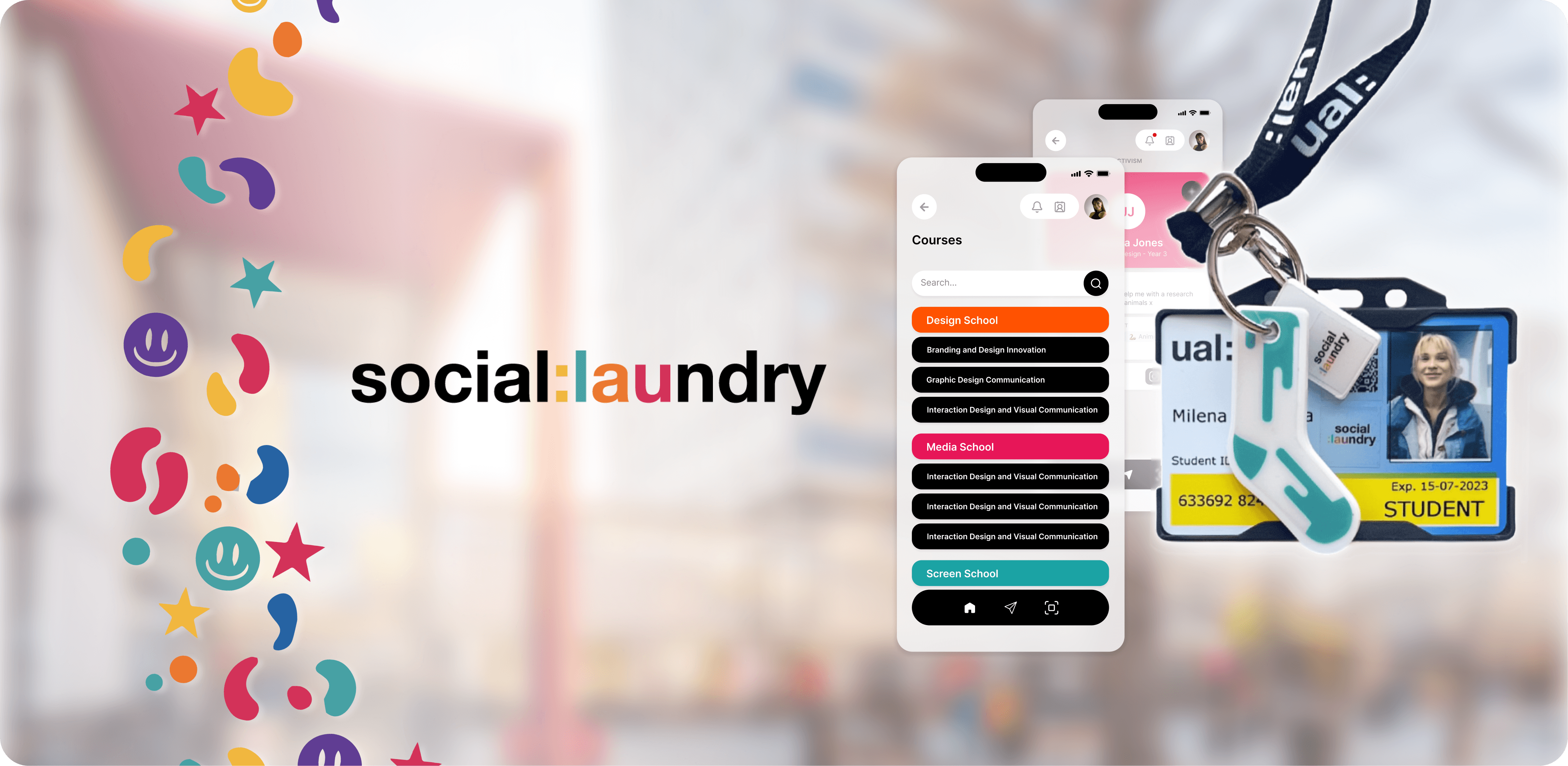
The system has four connected parts: a visual identity, a campus-wide poster campaign, a physical Sole Mate keychain system, and a companion app. Every student receives a sock-shaped keychain in a unique pattern alongside their UAL ID, then hunts for their match across the student body, a low-stakes, physical excuse to approach someone new. Finding your match unlocks the next step in the app, where students can keep the connection going and search across courses and disciplines to find collaborators long after the first conversation ends.
One decision needed rethinking. The "sole mate" mechanic, matching identical keychains, is built on similarity, while the project's whole point is celebrating difference. Rather than change the mechanic, I reframed what it meant: finding your match doesn't celebrate sameness, it shows that even a diverse student body still shares real common ground.
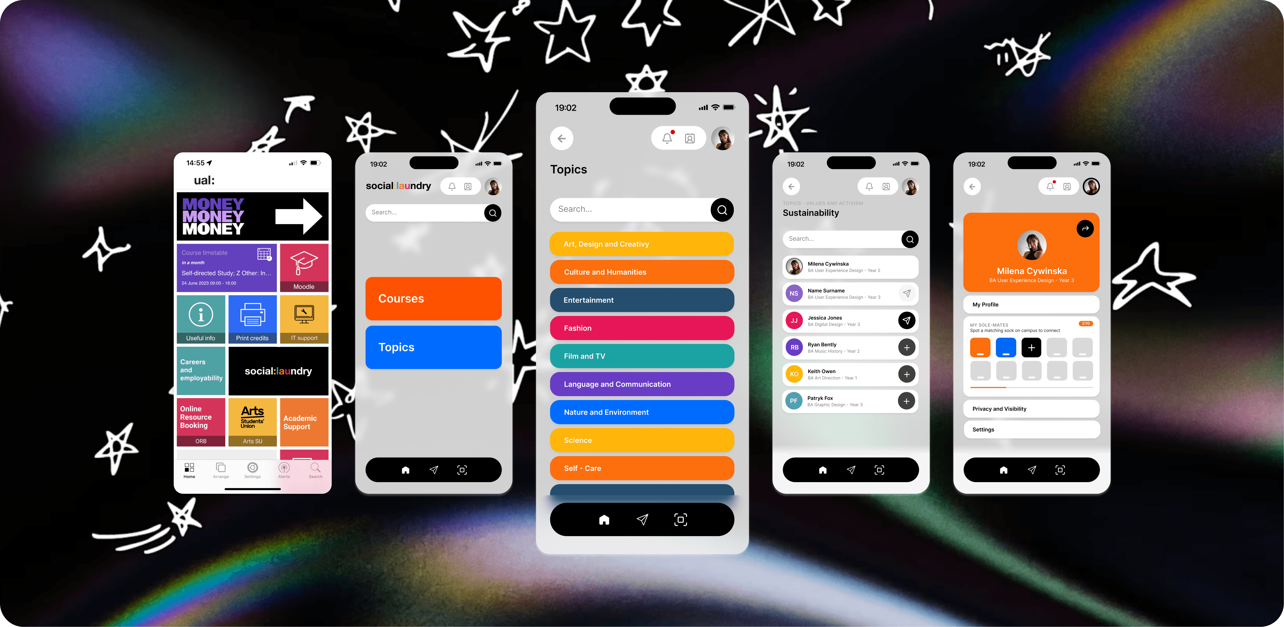

Before launch, the app was tested with four students on task-based exercises, no guidance given beyond a short concept explainer. Two things changed as a result: the sole mate progress showed as a visual only, so I added a plain text summary since people couldn't read their status from it, and three of four expected the contact book under Messages rather than Connect, so I added it there too.